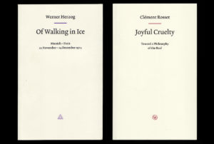
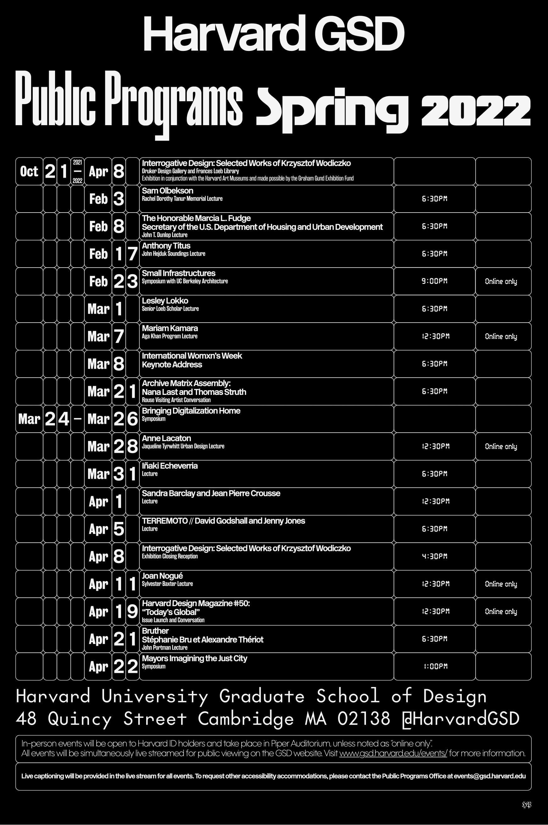
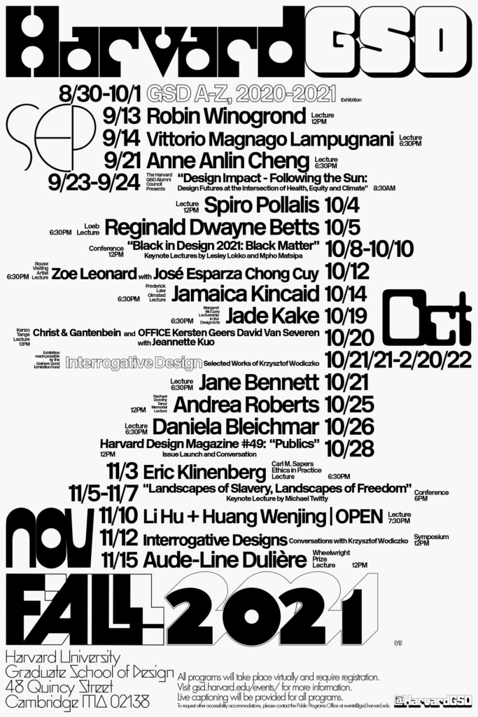
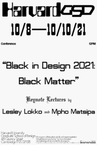
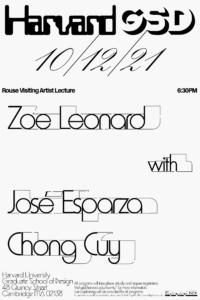
 The Harvard Graduate School of Design’s art director Chad Kloepfer first came across designer Harsh Patel’s work in two books: Of Walking in Ice by Werner Herzog and Roman Letters by Evan Calder Williams (co-designed with Mark Owens). “They both felt as if they had landed in the here and now from a different era,” says Kloepfer. “It was hard to pin down a reference point and I was immediately charmed by the mystery and mood of it all.” It was in part due to these two exquisite objects that Patel was invited to design this year’s public programs posters, the second iteration of which will be unveiled today with the announcement of the spring semester’s public programs. Kloepfer and Patel sat down to discuss design practice and thinking in a world that’s pushed ever further into the digital sphere.
Chad Kloepfer: Coming into this season’s public programs posters, we were interested in pushing this project somewhere new, graphically. Can you talk about your entry into the process and the creation of this poster?
Harsh Patel: In our initial discussions, I suggested that the seemingly straightforward task of presenting this information could simultaneously express two different feelings about the second year of this pandemic. The first approach—reflecting how introspective everything sort of got, assuming you stayed inside—was to be pared down typography, in a kind of first-person singular voice. It would be laid out in dense, intricate grids with pragmatic but idiosyncratic typefaces like the original Futura. The second approach resonated more with me on a personal level, although it made for a far less practical working methodology. It’s a visual summary of the anxious barrage that we stepped into when we went outside. The public programs poster and all of the individual event posters are pastiches of these ideas.
I want to backtrack for a moment and ask: when you get a commission like this one—where there is not a lot of specificity to the brief—how do you begin to generate an idea or concept? Do you have a methodology that applies to a broad range of work, or is it a different working model, specific to every project?
Employing a set methodology could make things easier on myself, financially. Designers in the cultural sector with one of those in place really do manage assembly-line operations, especially in cities like New York. But, no: the problem-solution model isn’t something I believe in. There’s sometimes a financial incentive to commit immediately to a project like this and think backwards from a timeline or budget, but nowadays it’s more important to find a meaningful intersection, and to know when to say no.
Something I’ve always appreciated about your work is how it defies an easy definition. Almost every component of the work appears, to me, to be “found” for lack of a better word—which I mean as a compliment—and this poster is no exception. How did you arrive at the mixture of different typefaces used on the poster and how do you see that relating to the form of the lecture poster?
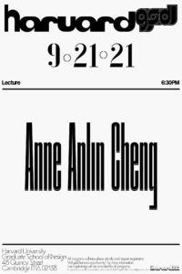
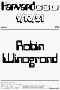
The typography is a capsule of street level commercial design—mostly the more vernacular kind that preceded today’s digital hypermarket. It’s the lettering on a paper cigarette package, or the logo on the underside of a plastic toy, or the made-to-order lightbox signage of a fried chicken shop. The only purely institutional component was the base typeface, Margaret Calvert’s New Rail.
Is there a strategy to the typeface(s) chosen for each lecture, or is it something you come at from a more instinctual place?
There’s no set strategy, other than going for lesser-known types.
The posters for the GSD are strictly typographic, but I’ve always been curious about your use of imagery; it’s quite specific. How do graphics and imagery find a place in your work?
In our profession, we typically receive photographic content pre-determined to fit within the image-and-copy relationship that defines most advertising design. We are usually granted some license to manipulate these images and attempt to subvert their meaning, as long as we remain within the bounds of the brief. This framework just isn’t that interesting to me. Graphic design shouldn’t willingly constrict its expressive possibility to that kind of messaging.
We also have more access to images and to the means of comparatively simple image making than ever before. In my intro courses, a ground concept is that we can articulate our aesthetic subconscious into visual form. It takes confidence and honesty to mine those depths and hone meaning into an individuated language or style. Making images is only meaningful or fulfilling if I feel that the translation from thought to expression is clear and concise, that the process is economically sensible in terms of time and resources, and that there’s ideological consistency in the bird’s-eye view.
We spoke briefly over Zoom about the relationship, or influence, of European design on US design. You were born in Nairobi and you currently work from both Los Angeles and New York City: how does both a sense of place and design’s many histories enter your work?
My upbringing in India and Kenya gave me a set of cultural experiences that shaped how I see myself amongst the world, generally. The American cities I’ve lived in as an adult have shaped my critical outlook and working methodology. Certainly my perception is that our daily practice hasn’t fully realized the value of biographical self-examination. It usually draws a freehand line to mid-20th-century European techniques that were engineered for workhorse production and systemic portability. As an immigrant and as someone who is interested in more intimate, or sensitive, ways of creating and appreciating, I protest this reality more than I accept it.
I find this approach very beautiful and refreshing—and it brings to mind the influence and power of “local” design histories. I feel like there is still so much to learn from both individual and local practices.
Yeah, there is. I’ve taught and talked about the history of graphic design for 10 years now. A public archive of that class material is slowly building up here. Every example there asks questions about how and why things are categorized.
You work as both a traditional designer (taking commissions) and with self-generated content. How does either side of that coin inform the other, if at all?
Assuming I say yes to the right projects, then there shouldn’t be a marked difference. By sharing my editorial skills with my collaborators, and helping them identify some of their own visual amalgam, we usually find an authentic communication strategy.
I find being a graphic designer is to exist very much in a gray zone, which brings to mind the question of designer as editor, designer as artist. How do you see your role within the work or a given project?
The initial discussions—where you exchange values and decide what’s interesting, sustainable, and efficient—should take considerable time. Traditional studio structures operating on bureaucratic calendars can’t manage this as easily as someone with a completely solo operation like mine. My role is at first articulative, and then about devising expressive strategies.
Thank you, Harsh! We look forward to unveiling this spring’s public programs posters.