Visualizing Systems: The Reading and Representation of the Human Environment
Andrea Hansen, Exhibit Design
November 19,2012–January 21,2013
Visualizing Systems: The Book and the Blog
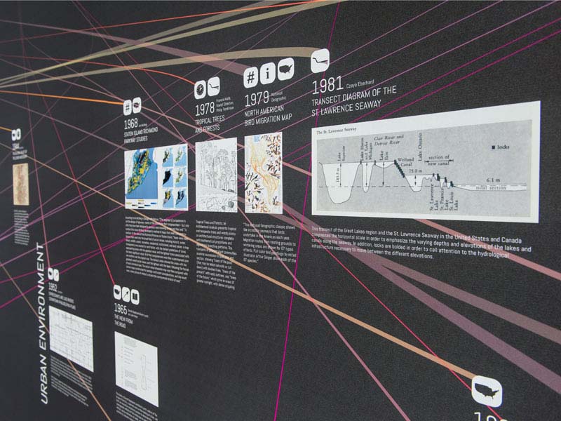
Visualizing Systems presents a selection of the most important visualizations and mappings of the human environment from 1800 – present. The collection considers the three-dimensional world—and the spatial, material, and temporal complexities that come with it—in order to document visual language that balances quantitative rigor and scientific methodology with tangible experiential descriptions of the groundplane as seen at eye level.
The website above (visualizingsystems.com) is intended as a companion piece to an eponymous book by Andrea Hansen to be published by Princeton Architectural Press in late 2014. In addition to serving as an extended, catalogued repository for the examples featured in the book, the site encourages community uploads in order to foster discussion and serve as a testing ground for visual case studies that exemplify the spatial potential of data and visualization in the design fields. How does the display of data and information differ for the design professions? What are the relationships between cities and their ecological contexts? How do water, weather, plants, animals, geology, climate, etc. affect the built environment, and vice versa? How can we harness the increasing power and availability of big data to map and track the relationships between urban and ecological systems, nature and culture, and landscape and infrastructure, in a way that is not only BEAUTIFUL, but also PRECISE and CONCISE? And most importantly, how can the creation of clear and concise visualizations that explain a complex and changing world help to confer a new legitimacy to architects, landscape architects, and planners as they aim to carve out more prominent roles as policy makers?
Curatorially, the site differs from other data visualization hubs in its focus on the spatial environment as well as its cultivation of a rich collection of historic imagery. While infographics and data visualizations are trending now, the techniques they employ are founded upon several milestones in visualization and analysis—from design, art, and the sciences—that are called out in this exhibit. By retracing the development of representational techniques that are commonplace today, we can encode new layers of meaning, thereby increasing the operativity of the drawing.
Visualizing Systems: The Experiments
The vignettes shown above offer a series of experimental techniques for representing spatial data. Drawing from the examples seen at right, the techniques are the beginning of a catalogue of system-specific modes of representation that characterize the material, temporal, scalar, and modal qualities of systems as diverse as storms, rivers, highways, and cellular networks. The parametric techniques, developed with Grasshopper and GH components, are largely founded upon GIS spatial analysis, but unlike GIS, utilize rendering modes such as point clouds, gradients, grids, and vector fields to relate more closely to the systems they measure.
– Andrea Hansen, Lecturer in Landscape Architecture (2011-2012 Kiley Fellow)